Researching the City of Berlin – Typography – Actual Size Magazine
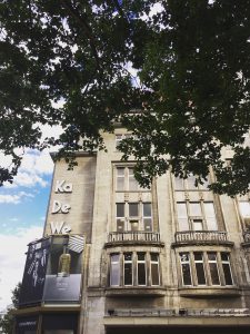
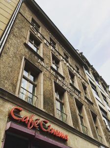
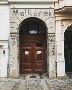
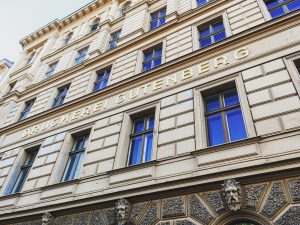
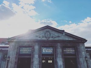
As part of my typographical field research, I wandered the city of Berlin to seek out any surviving commercial signs, particularly on the facades of buildings, that bear witness to earlier times.
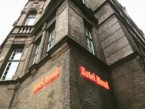
New Manchester-based print magazine Actual Size (https://www.actualsizemagazine.com) contacted me on Instagram (https://www.instagram.com/heike_schneider_matzigkeit/) after spotting one of my Berlin typography photographs, the Hotel du Monde, to enquire whether I would like to contribute a feature to the first issue of the magazine.
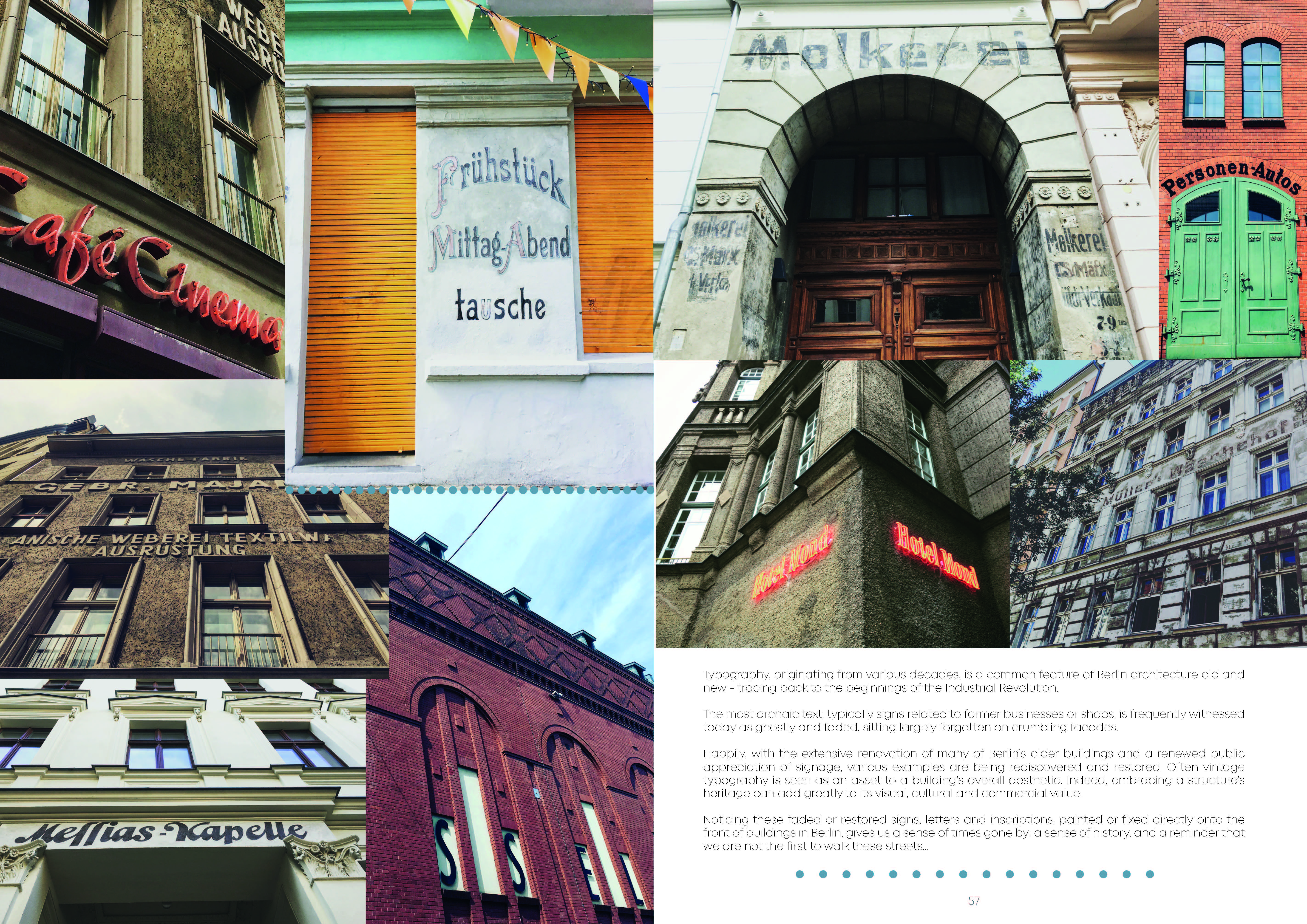
Typography originating from various decades is commonly featured on Berlin architecture old and new – tracing back to the beginnings of the Industrial Revolution.
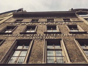
The most archaic text, typically signs related to former businesses or shops, is frequently witnessed today as ghostly and faded sitting sadly forgotten on crumbling facades.
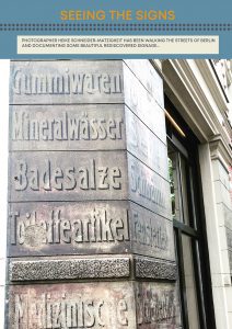
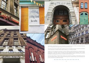
Happily with the extensive renovation of many of Berlin’s older buildings various examples are being re-discovered and restored. Often vintage typography is seen as an asset to a building’s overall aesthetic. Indeed embracing a structure’s heritage can add greatly to its visual, cultural and commercial value.
Noticing these faded or restored signs, letters and inscriptions painted or fixed directly onto the front of buildings in Berlin, gives us a sense of times gone by, a sense of history, and a reminder that we are not the first to walk these streets…
www.actualsizemagazine.com
It’s especially lovely to see myself in the contributor’s section 😉